Over the course of the semester WSU Interior Design sophomores worked with Seth Anawalt to redesign the St. Elmo Hotel, a historical building in the Palouse WA. Our task was to design the second floor which includes a one-bedroom apartment, a two-bedroom apartment, a common area and a spa. We were in charged to remodel the one-bedroom apartment and the common area for or final project.
As I previouly mentioned, in earlier projects we designed the kitchen and bathroom of the two-bedroom apartment of the St. Elmo Hotel. Both of these projects were very challenging since this was my very first time designing a kitchen a bathroom. The most challenging of the two was the Kitchen since there are a lot of codes and standards that need to be followed and I had to learn many of this. The bathroom project was easier since the same standards i had learned before for the kitchen project also applied, yet designing an entire apartment was different and challenging as well.
Process Poster
 |
This is the firt of four posters. Here I have included my inspiration as well as the concept model from which my design originated. The second floor, floor plan is also included as well as materials used more than one throughout the one-bedroom apartment and the common space.
|
There are several areas that make up the apartment design, entry, living room, kitchen, bedroom and bathroom, even though there are five key areas, they all need to work as one to form a cohesive and holistic design. The client asked for an open floor design, flowy space almost as if you coul dance in the space. My approach to this design was to create a sense of unified infinite protection in the space. To accomplish this, I incorporated layers in the space as well as curvilinear line to represent the linkage of a unified protection. Layers are also visible in the color palate; I choose a complimentary color scheme of yellow- purple with red accents. Each of the colors relates to my concept of home, and represents the meaning of home for me; yellow represents the warmth I find at home, while purple represents the loyalty and respect also found at home, while red represents the love of a home. Each of the spaces emphasizes a specific color from my color scheme, this way layers are created.
Bedroom and Bathroom Poster
 |
This is the second poster, displaying elevations and perspectives of these two spaces, as well as the materials used.
|
 |
| Here the color choices and the layout of the room can be is clearly visible. |
Living Room and Kitchen Poster
Living Room/Kitchen Perspective
 In this poster, I have included all the materials and elevations of these two areas, as well as the floor plan of the apartment. I have one overall perspective which displays the living room and kitchen very accurately as well as a dining area. As seen in these posters, each room is emphasized by a specific color in the palete and then accented with the other two colors in the palete.
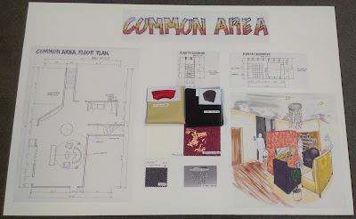
Common Area Poster
Common Area Perspective
 |
| As seen on the perspective, the same color palete has been carried to the common space as well. A fire place provides privacy for people coming out of the elevator and those on the seating area. |
One key element of design is to be able to visualize the space not only in 2D but also volumetrically, 3D form, this can be done through renderings, or in this case through a study model. This model helps me see the space as if I were walking through the apartment.
Volumetric Model
Interior of the space, with a volumetric kitchen, shows the scale and flow in the space. A coffered ceiling helps lower the 10 ft high ceiling visually, runs trough entire apartment, except in the bathroom.
On this project I have learned a lot and grown since I first design the kitchen and bathroom in the two-bedroom apartment. I used the same concept, yet the aesthectic in the one-bedroom apartment reads better and it is also more functional than the two-bedroom apartment. I feel very accomplished and happy with the choices I made.


No comments:
Post a Comment