Ride, Don't Walk
One challenging experience was to ride on a wheelchair, to experience how people with disabilities view the world, and how the world looks at them. For one it was very interesting to notice how people keep staring at other people with disabilities for a long period of time, making it very uncomfortable. The other aspect is to notice how many buildings are not suitable for Accessibility, especially old buildings, which don’t even have big enough doors to allow people in a wheelchair through.
Doors in Daggy Hall, WSU Pullman, had barely enough clearance for the wheelchair, yet no clearance for my hands, hence I'd hurt my hands rolling the wheels while going through the door.
Elevators are also a problem when it comes to accessibility if they are very confined, not enough clearance and space to move around. This was my first time getting in an elevator using a wheelchair, a small elevator I have to say, and it was very challenging, as it can be appreciated in the image above it was hard to enter the elevator and little clearance made it hard to maneuver the wheelchair, to the point that the doors were closing on me, if it was not for my classmate helping me, those doors would have bruised up my arms.
Entering a restroom was hard, yet trying to enter a bathroom stall was even harder when it is not accessible. The clearance behind me, was not enough to turn and the stall was not big enough, period.
I was not able to get all the way in, this is the farthest I could get into the stall, if it was a real emergency, I don't know what whould have happened.
One more thing in accessible restrooms other than enough clearance, is to have space under the sink, which in this case it did not became an issue, there was enough clearance underneath, yet the mirror is not tilted, I had to stretch my neck to see my reflection in the mirror.
When asking for a cafe in our Expresso Bar, it was hard to see beyond the counter, my view point is very low, compared to the people standing behaind the bar.
This is the first thing I saw looking straight at the bar, I had to look up to see beyound this point.
People behind the coffee bar had to stretch over the counter to see me.
This sketch shows all I could see after looking up, I do not see any of the appliances behind the counter, not even the big refrigerator, all I see from it are the red and yellows stripes on the back. It was also hard to read the signs.
After this exercise now I understand why ADA stalls are so big and usually the toilet is at the corner, before this I had never really paid attention to this fact.
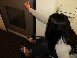
Opening the door was hard, as it was before entering the bathroom, the handle is in a very awkward position and as it can be appreciated in the image above, reaching out to it was hard as opening the door was blocked by my feet and wheelchair.


No comments:
Post a Comment