Sketch Journal Cover Page
Still Life Fruit Study
For this sketch I studied the relationship of light on objects. For my sketch I arranged three apples in a bowl, then with the use of sketching techniques; hatching, crosshatching, I modeled the shadow emitted by the arrangement. I really enjoyed discovering and observing what happens around us daily, and since it's so common we hardly notice those small details it is a pleasant surprise to rediscover them once again.
Mind Map
This was an experimentation to see what consciously and unconsciously we keep stored in our minds. I was amazed to see how such a "simple" word triggered so many thoughts and memories within a short period time of 15 minutes. Going from color to a visual representation of a cup of coffee was very interesting and fun!
Napkin Sketch; Plan view and Perceptive of my room
This sketch shows how ideas do not need to be drawn on the fanciest media, since ideas are just the beginning of great designs. Once again, exploration and observation play a huge role when sketching and designing. It is very important as a designer to visualize and understand that there are many possible views/aspects to anything in life, yet technically this is done by professionals everyday. There are many views to structures, and here I present two, plan view and perceptive.
Chair Views
Relating back to the previous sketch, the Napkin Sketch, it is very important to recognize and be able to draw the different views of objects. Each specific view provides important information regarding the object's qualities. For example it is hard to identify true measurements from a perceptive drawing since proportions are not accurate; moreover, a side view can provide us with the height and more measurements of our object.
Shade and Shadow of Room Corner
This sketch was is one more exploration of light and objects. Observing how light creates very interesting shadows in room corners. It is very interesting to see how adjacent walls seem to be at a great distance when only one is lit up, and the other one is cover in shadows.
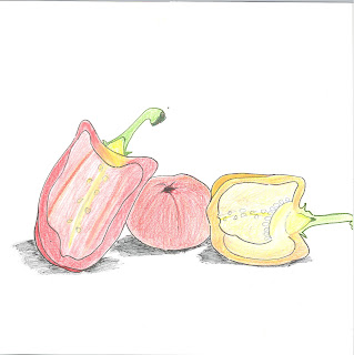
Fruit Cross Section
For this particular sketch, we had to choose three pieces of fruit or vegetables, and slice two of them, section cut, after that we had to arrange them in a nicely matter and sketch observations. The point of this exorcise was to learn more about section cuts and see how these transfer onto paper!
Figure Tracing from Photograph
The previous sketch and this new sketch were practice for a drafting project of a room. In this drafting project we included basic drawings such as floor plan, elevations and a section drawing. When drafting, it is really important to show scale and what better way to do this then showing a person, entourage, in the drawings. The forms have to be fairly simple, since if too much detail is added it can be distracting for the viewer. As you can see in this sketch, only contour lines are shown and detail is minimal, yet enough for us to see this is a women dancer performing a pirouette.
Hardware Element on Black Paper
The assignment for this particular sketch was to utilize black paper as the main canvas with color pencils, chalk or pastels, to sketch a small hardware element. The purpose was to cover the black paper and let nothing but color cover the entire surface. I sketched cabinet door hinge. I decided to use bold complementary color schemes, red-green and yellow-violet to emphasize the hinge, in white.
Chair Negative Space
For this sketch the assignment was to observe positive space and furniture through negative space, that is paying attention to the relationship of figure and ground created by the chair. In this case now the chair is negative space, and everything else surrounding it becomes positive space.
Value Study in Line
The assignment for this sketch was to study value, light and shadows created by a window wall in a space, and translate those values with the use of line weight only. As it can be appreciated in this room, I used lines all throughout the sketch to show textures and value, lighter lines indicate sunlight entering through the windows, while the darker lines are the shadows created.The roof shows this clearly as there are different values and tones created by shadow.
Value Study-Contrast
There are two parts to this sketch, the second part was to use high contrast to show the value in the room. It is the same room, only a different technique has been used to translate light and shadow. Here I did not show any of the texture of the space or the furniture, all I show is values to record the way sunlight enters the room.
Sketch Journal Back Cover
The Sketch Journal assignment was to start sketching, to develop our communication and observation skills, to then bind all the sketches in a finalizing sketch book.
During the period of this course and through the process of sketching I learned to pay attention to detail and became a critical observer. I learned that sketching is not based on artistic abilities, yet it involves strong communication skills to deliver a clear message. My skills in one point perspective have developed, in my Napkin sketch my proportions were off, yet time and effort paid off when on my last sketch, Extreme Contrast, I was able to deliver a more proportioned sketch.
Hand-drafted Reflection


