MIXED WORLDS
My long term project is finally complete, after a long semester of hard work and effort it's great to see the finished product. This project consisted of re-designing the Pufferbelly Depot, in Pullman WA, which used to be a train station and later on served the purpose of a clean canvas to let our imaginations fly. The new design had to accommodate a residence,studio space and a gallery space for an artist who has a
spouse that is visually impaired. One of the challenges involved in this project was to design for the visually impaired, and as I have mentioned before on my previous post, Can you Design to Help them "See," a lot of research and hard work went into this aspect of the design. As designers we design for people and our task is to make their living spaces functional and practical. Another important aspect was to come up with a sustainable design allowing for adaptive reuse. This aspect was fun and interesting, understanding that design is not about demolishing existing structures to create something new, moreover, it is designing creatively to mix the old and the new to create the unthinkable. This idea is what inspired my design, mixing the old and the new worlds to create something different.
 These boards are the final product, the compilation of this semester's hard work, all arranged in a simple yet interesting way to communicate the basic and essential information about my design to the client.
 The first board is the process development board, here the core of my concept evolves, telling the story from beginning to end, inspiration object to final floor plan layout. This board is one of the most crucial boards since this is the foundation of the entire project. Everything links back to the concept developed here, every decision made, every material chosen, every little element part of the design is not
chosen randomly, it has a purpose and roots from the concept. Two worlds coming together to form a new, unified world; nature and technology coming together.
One drawing is not enough to inform the client and others about the technicalities of the design, there are several of this technical drawings needed, here I have just a few, yet crucial drawings. A section and the demolition plan along two elevations are part of this board. The demolition plan consists of the original walls in the building as well as the new construction walls, designed by me. The section informs the client about the height, third dimension, of the design and the elements found in the floor plans.
 This drawing is specially helpful when it comes to understanding ceiling changes. Other drawings that help the client see the space are the elevations. These are "flat" drawings, 2D only,depicting specific areas in the design, here elements such as furniture, accessories, are drawn with great detail and clarity.
The furniture plan is another crucial drawing, here all the selected furniture pieces selected and all the wall changes are depicted. For this project, I decided to render the furniture plan since it is such a easy drawing to read and helps the client understand a bit

 more of where things go and how they relate to the concept and the floor plan.
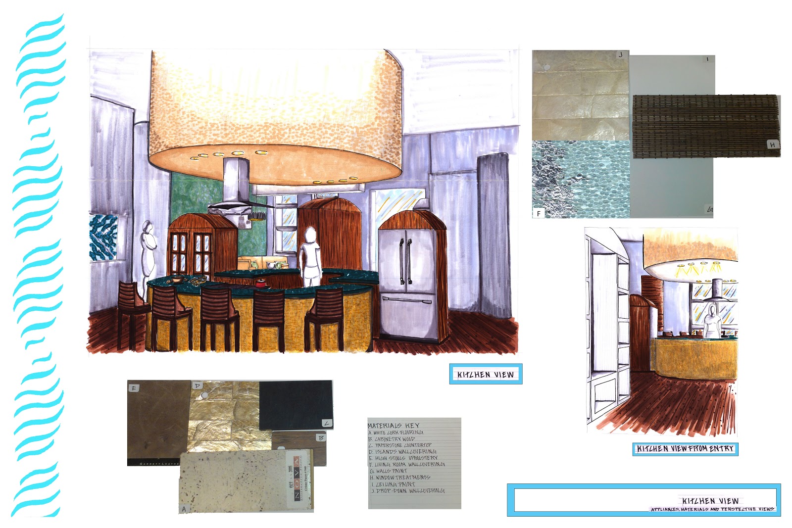
Other drawings, a bit less technical yet not less accurate, are perspective drawings. These are a bit more fun since this is literally a picture depicting what the spaces designed will look like once built.
I decided to draw two perspectives of the kitchen since it has a key feature in my design. Two round islands with two vertical elements signifying the union of two worlds, nature and technology. The concept of this design. Samples of materials in these spaces are usually shown on these boards as well, this helps the client see what their spaces will look like not only through a picture but through these samples.
All these aspects are great, fun and exciting, seeing my design come to life, yet other crucial elements are also part of design, the safety of individuals interacting with the space is as important. In this board this aspect is addressed. The egress plan informs the client and the validated authorities about the available exits needed in case of emergencies. The egress path is also recorded that is, the distance from the furthest point in a room to the exit. For this project, the distance could not be more than 75ft. This distance allows individuals to exit the building in a safe manner without any obstacles.

In this following board I decided to include two more perspectives. A perspective depicting the master bathroom and the family room. These rooms have key elements that inform the client about the overall design decisions made. Not everything can be shown hence the importance of choosing wisely to provide the client an accurate overview of their spaces.
This bathroom posses great features such as curved walls and a round shower stall, allowing for a 60 inch turn-around. Drop downs are crucial since they lower the ceiling, making the space feel more comfortable
and intimate. The family rooms shares the ticket wall, a

wall that had to be kept untouched requested by the client. A revolving TV is also found in this room making the space flexible to accommodate people in wheelchairs. Once again material samples are provided to give the client a deeper understanding of the spaces.
A board containing a rendering of the exterior view of the Pufferbelly Depot and a rendering of the site plan is also important information for the client. This drawings show the current state of the facade of the building and the landscape. This is another aspect which I am proud of. I designed the landscape around my concept. This can be seen in the parking lots and landscape features all throughout the depot. I focused in the balance between curved and rectilinear lines.
 Last but not least is the board containing information about the gallery space and the artist. This was another challenging aspect of the project and a lot of time and research went into learning the best strategies to display art and to keep it safe. In my previous post Art Gallery Visit, I dedicated one day to visit a gallery and learn more about he mechanics involved in these spaces. This was my first time designing a gallery space, this was really fun and interesting. I have applied my pattern, a textile pattern that I designed earlier in the semester; I will talk bout next. This is one way of how I incorporated my concept. Curved clouds and the orientation of the display walls, forming implied movement, are other elements that link back to my concept. I refinished the concrete floor and stained it to create a design mimicking the clouds. Little things like this make a huge difference in design, they make the depot more sustainable. I carried the same color pallete used all throughout the depot, neutrals with blue-green accents. This pallete was inspired by my fabric textile.
Over all this project was a great experience. It forced us to learn and apply new concepts into our design while keeping in mind the restrictions that as designers we come across daily. All that I have learned this semester will definitely help me next semester as well as all throughout my design carrier.

 The first board is the process development board, here the core of my concept evolves, telling the story from beginning to end, inspiration object to final floor plan layout. This board is one of the most crucial boards since this is the foundation of the entire project. Everything links back to the concept developed here, every decision made, every material chosen, every little element part of the design is not
chosen randomly, it has a purpose and roots from the concept. Two worlds coming together to form a new, unified world; nature and technology coming together.
One drawing is not enough to inform the client and others about the technicalities of the design, there are several of this technical drawings needed, here I have just a few, yet crucial drawings. A section and the demolition plan along two elevations are part of this board. The demolition plan consists of the original walls in the building as well as the new construction walls, designed by me. The section informs the client about the height, third dimension, of the design and the elements found in the floor plans.

The furniture plan is another crucial drawing, here all the selected furniture pieces selected and all the wall changes are depicted. For this project, I decided to render the furniture plan since it is such a easy drawing to read and helps the client understand a bit

Other drawings, a bit less technical yet not less accurate, are perspective drawings. These are a bit more fun since this is literally a picture depicting what the spaces designed will look like once built.
I decided to draw two perspectives of the kitchen since it has a key feature in my design. Two round islands with two vertical elements signifying the union of two worlds, nature and technology. The concept of this design. Samples of materials in these spaces are usually shown on these boards as well, this helps the client see what their spaces will look like not only through a picture but through these samples.
All these aspects are great, fun and exciting, seeing my design come to life, yet other crucial elements are also part of design, the safety of individuals interacting with the space is as important. In this board this aspect is addressed. The egress plan informs the client and the validated authorities about the available exits needed in case of emergencies. The egress path is also recorded that is, the distance from the furthest point in a room to the exit. For this project, the distance could not be more than 75ft. This distance allows individuals to exit the building in a safe manner without any obstacles.

In this following board I decided to include two more perspectives. A perspective depicting the master bathroom and the family room. These rooms have key elements that inform the client about the overall design decisions made. Not everything can be shown hence the importance of choosing wisely to provide the client an accurate overview of their spaces.
This bathroom posses great features such as curved walls and a round shower stall, allowing for a 60 inch turn-around. Drop downs are crucial since they lower the ceiling, making the space feel more comfortable
and intimate. The family rooms shares the ticket wall, a

wall that had to be kept untouched requested by the client. A revolving TV is also found in this room making the space flexible to accommodate people in wheelchairs. Once again material samples are provided to give the client a deeper understanding of the spaces.
A board containing a rendering of the exterior view of the Pufferbelly Depot and a rendering of the site plan is also important information for the client. This drawings show the current state of the facade of the building and the landscape. This is another aspect which I am proud of. I designed the landscape around my concept. This can be seen in the parking lots and landscape features all throughout the depot. I focused in the balance between curved and rectilinear lines.
 Last but not least is the board containing information about the gallery space and the artist. This was another challenging aspect of the project and a lot of time and research went into learning the best strategies to display art and to keep it safe. In my previous post Art Gallery Visit, I dedicated one day to visit a gallery and learn more about he mechanics involved in these spaces. This was my first time designing a gallery space, this was really fun and interesting. I have applied my pattern, a textile pattern that I designed earlier in the semester; I will talk bout next. This is one way of how I incorporated my concept. Curved clouds and the orientation of the display walls, forming implied movement, are other elements that link back to my concept. I refinished the concrete floor and stained it to create a design mimicking the clouds. Little things like this make a huge difference in design, they make the depot more sustainable. I carried the same color pallete used all throughout the depot, neutrals with blue-green accents. This pallete was inspired by my fabric textile.
Over all this project was a great experience. It forced us to learn and apply new concepts into our design while keeping in mind the restrictions that as designers we come across daily. All that I have learned this semester will definitely help me next semester as well as all throughout my design carrier.


