Thursday, September 20, 2012

Concept development


 Concept Development

As designers it is really important to translate and communicate ideas to clients, a very basic way we do this is by sketching and providing visuals for others to understand and "see" our ideas. It is very important for as to develop 2D sketches to 3D models and then finally to functional spatial ideas. On this project develop a concept for my idea of "Home." Three keywords that came to me when analyzing this concept are Protection, Unity and Infinity.


2D Thumbnail Sketches

Developing a concept always involves developing many options to finally produce a unique and functional solution to any problem, usually through sketching and annotating sketches.These are the thumbnail sketches I came up with after analyzing my three keywords, which helped me to develop a 3D concept model.

3D Study Models

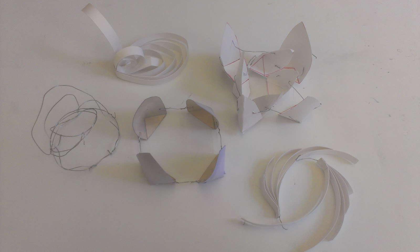
After working on my thumbnail sketches I developed several study models to communicate my concept of Home.
Final Concept Model


The final 3D concept model has high quality materials, as well as any application of final details, such as color. I tried to emphasize on my three keywords, protection, unity and infinity, by creating layers of protection in my model through forms and color. Wire links the entire structure, unifying it, while the wire loops throughout the structure, providing the sense of an infinite unity which protects me from the outside world that to me is HOME.


Final Parti


A parti is an idea which influences our concept, and here I have a rough draft of my Concept Statement. My parti was influenced by a poem about home, from that I developed my 2D sketches which then turned into my study model, which helped me communicate my idea of Home.


Sustainable Design Context Poster


Sustainable Design has become a trend in recent years; there are many things that designers can do to incorporate very simple aspects to create strong and long lasting design.  I have created a poster that touches on a specific case study on sustainable design, while focusing on sustainable finishes.

I collaborated with a group of people to create the poster’s layout, creating an effective way to communicate the information we gathered. As I mentioned earlier, I focused on sustainable finishes, countertops, and I had a blast researching on the so many options available. I came across recycled paper countertops, recycled glass, beautiful and sustainable options for long lasting design.

I learned to comprehend and embrace sustainable design while creating the poster, it’s all over the news and many people talk about it, yet when we do a little research on our own, things are more clear and then we can fully understand the aspects of such “hot” trending topics.  

 
Draft Poster
 
 Here is our first attempt for the layout, after analyzing our work; several changes were made to effectively communicate our information.


Saturday, April 28, 2012

Process Poster

Process Poster
The assignment for this project was to create a digital poster, using InDesign, that describes the development and process work of a previous project, done in one of our studio classes, without having us present to describe our work. The goal here was to use organizational and layout techniques to display information in a relevant and clear manner. Graphic elements as well as color theory are important in the development of the poster, things need to be cohesive and relate to each other. During this project I was able to enhance my InDesign skills, while learning how to use other software,Fireworks. This project utilized all the skills we have learned so far, Photoshop,Illustrator, InDeseing, as well as our sketching techniques and graphic elements.

Wednesday, April 18, 2012

Resume


Resume

The assignment for this particular project was to create a creative resume using InDesing for the resume layout. Other than focusing on the content and audience of the resume the objectives were to understand and use good graphic principles to organize the information using InDesign tools. It is very interesting how a good layout can make a huge difference when it comes to having people considering you as a potential employee. Creating a resume is a task of its own, yet creating a creative resume is harder than it seems; moreover, creating a minimalistic and simple resume is even more complex. This resume represents me as an individual and as a designer as well. I wanted to show a sophisticated layout, not leaving behind or taking away from the content, yet sophistication does not mean boring, I added color which comes right off my logo, violet and yellow, and to emphasize and tie everything else together an accent hue was added.

Monday, April 9, 2012

Logo


Logo

The task in hand for this project was to create a logo that describes and represents us, using our design philosophy as the inspiration for the logo. This logo was created in illustrator which is a software program similar to Photoshop, and the Wacom tablet. Both tools used to create the logo were completely new to me before starting the process of creation. The tablet is a perfect mix of digital drawing and hand drawing, which takes sketching to a new different level. The design that resulted after pondering for a while, and with the use of the tools provided, represents my stage as a designer up to this point. It is simple, as less is more, combing my initials, G and Z, as well as my last name. There is contrast not only with color but also with the fonts used. I thought a complimentary color scheme would bring to the table the contrast I was looking for. I chose violet and yellow as my scheme since the meaning of the hue describes my character as loyal, energizing and very imaginative, also my friends know that violet is my favorite color. The use of cursive writing describes the side of me that is delicate, formal, and simply beautiful, and that is something I hope to achieve through design.  


 Wacom tablet Sketches


Hand Sketches

Wednesday, February 15, 2012

Sketch


Sketch Journal Cover Page


Still Life Fruit Study


For this sketch I studied the relationship of light on objects. For my sketch I arranged three apples in a bowl, then with the use of sketching techniques; hatching, crosshatching, I modeled the shadow emitted by the arrangement. I really enjoyed discovering and observing what happens around us daily, and since it's so common we hardly notice those small details it is a pleasant surprise to rediscover them once again.


Mind Map


This was an experimentation to see what consciously and unconsciously we keep stored in our minds. I was amazed to see how such a "simple" word triggered so many thoughts and memories within a short period time of 15 minutes. Going from color to a visual representation of a cup of coffee was very interesting and fun!


 Napkin Sketch; Plan view and Perceptive of my room

This sketch shows how ideas do not need to be drawn on the fanciest media, since ideas are just the beginning of great designs. Once again, exploration and observation play a huge role when sketching and designing. It is very important as a designer to visualize and understand that there are many possible views/aspects to anything in life, yet technically this is done by professionals everyday. There are many views to structures, and here I present two, plan view and perceptive.


Chair Views

Relating back to the previous sketch, the Napkin Sketch, it is very important to recognize and be able to draw the different views of objects. Each specific view provides important information regarding the object's qualities. For example it is hard to identify true measurements from a perceptive drawing since proportions are not accurate; moreover, a side view can provide us with the height and more measurements of our object. 


Shade and Shadow of Room Corner

This sketch was is one more exploration of light and objects. Observing how light creates very interesting shadows in room corners. It is very interesting to see how adjacent walls seem to be at a great distance when only one is lit up, and the other one is cover in shadows.


 Fruit Cross Section

For this particular sketch, we had to choose three pieces of fruit or vegetables, and slice two of them, section cut, after that we had to arrange them in a nicely matter and sketch observations. The point of this exorcise was to learn more about section cuts and see how these transfer onto paper!


Figure Tracing from Photograph

The previous sketch and this new sketch were practice for a drafting project of a room. In this drafting project we included basic drawings such as floor plan, elevations and a section drawing. When drafting, it is really important to show scale and what better way to do this then showing a person, entourage, in the drawings. The forms have to be fairly simple, since if too much detail is added it can be distracting for the viewer. As you can see in this sketch, only contour lines are shown and detail is minimal, yet enough for us to see this is a women dancer performing a pirouette.
Hardware Element on Black Paper

The assignment for this particular sketch was to utilize black paper as the main canvas with color pencils, chalk or pastels, to sketch a small hardware element. The purpose was to cover the black paper and let nothing but color cover the entire surface. I sketched cabinet door hinge. I decided to use bold complementary color schemes, red-green and yellow-violet to emphasize the hinge, in white.

Chair Negative Space

 For this sketch the assignment was to observe positive space and furniture through negative space, that is paying attention to the relationship of figure and ground created by the chair. In this case now the chair is negative space, and everything else surrounding it becomes positive space.
Value Study in Line

The assignment for this sketch was to study value, light and shadows created by a window wall in a space, and translate those values with the use of line weight only. As it can be appreciated in this room, I used lines all throughout the sketch to show textures and value, lighter lines indicate sunlight entering through the windows, while the darker lines are the shadows created.The roof shows this clearly as there are different values and tones created by shadow.

 Value Study-Contrast

There are two parts to this sketch, the second part was to use high contrast to show the value in the room. It is the same room, only a different technique has been used to translate light and shadow. Here I did not  show any of the texture of the space or the furniture, all I show is values to record the way sunlight enters the room.


Sketch Journal Back Cover


The Sketch Journal assignment was to start sketching, to develop our communication and observation skills, to then bind all the sketches in a finalizing sketch book.

During the period of this course and through the process of sketching I learned to pay attention to detail and became a critical observer. I learned that sketching is not based on artistic abilities, yet it involves strong communication skills to deliver a clear message. My skills in one point perspective have developed, in my Napkin sketch my proportions were off, yet time and effort paid off when on my last sketch, Extreme Contrast, I was able to deliver a more proportioned sketch.
Hand-drafted Reflection

Chinese Inspired Textile Pattern

 Concept Statement

The inspiration for this textile came from Chinese culture and their traditional saturated color palette used; gold, red, blue, yellow and green. The color palette in combination with their traditional motifs, dragons and fretwork inspired me to complete my creation. Chinese overall aesthetics is very formal and uses both symmetry and asymmetry. This is found in various design forms including buildings, interiors, fine arts and furniture. When composing my textile pattern symmetry created by the fretwork on top and bottom, yet the center image, the dragon another important motif in Chinese culture, incorporates that asymmetrical aspect. This color palette provides a variety of contrast, for instance the red and green, are complimentary colors, as well as yellow and blue, enhancing each other, I used tools in Photoshop to make these characteristics more obvious. 


30x30 Pattern 

The textile pattern is a continuation of my exploration of the Chinese culture. For this pattern I researched images from the 18th century, to incorporate into my design. These images are not as modified as before, yet it did take manipulation in Photoshop to put the composition together. I decided to use a dragon as the main figure since in Chinese culture it is a very important motif, along with their peculiar saturated color scheme; gold, red, blue, green and yellow. Another important aspect of Chinese culture is fretwork, which in my piece I included as a border on the top and bottom. The fretwork in my image was hand-drawn by me, then using tools in Photoshop I added the golden pieces shown, as well as a red outline. There is one more piece which takes us back to China, and that is their Blue and White Porcelain. This aspect was added as a background for the fretwork. Overall, I wanted my composition to simply express and show my inspiration, and represent Chinese culture though the unification of various components significant to this culture.