Monday, October 8, 2012

Urban Sketchers/Seattle

During the Seattle study tour, we had the opportunity to sketch with Seattle’s urban sketchers at Seattle’s sculpture park. This opportunity allowed me to keep improving my sketching skills from live which can be a little tricky for me, and what best way to keep learning then to have the urban sketchers around us. I spoke to one of them, and her sketches were amazing, as I approached her in astonishment, she kindly told me that all it take is practice and learning to see things around us, which after analyzing made me realize this is very true. When sketching, we need to observe and record what we see, hence learning to see the world around us, this means noticing shapes, color, shadows, surroundings, texture, little things that we take for granted.


This is my sketch at the sculpture park, and i have to say that I am very proud of it, as one of the sketchers told me is all about learning how to see things, and I payed attention to my surroundings, then I reallized that the building windows reflect other structures.

 
This is the view I sketched from live in the Sculpture Park,. People kept moving around, and that is why I did not draw them in my final sketch. 


Job Shadow

NBBJ Job Shadow
I had the opportunity to job-shadow Ashlee Holtman who is part of the interior designers working at NBBJ, Seattle; this design firm has done plenty of work in Seattle and also internationally. This was a wonderful experience since it was a glance to what the future awaits for me as an interior designer.
One of the first things we got to do at NBBJ was to meet Joyce Romanoff, the president of Maya Romanoff; a company specialized in surfacing materials. She presented the new line for wall coverings and provided some free samples. This was much unexpected and the privilege to meet her would have not being possible otherwise. Ashlee also offered a tour of the studios at NBBJ, which are divided in sections, healthcare, accounting/human resources, etc. for ease of communication in common projects.
 Other designers also offered their time to talk about their experience and projects, which just blew me away, since what I learn in class everyday and how I work in studio is very relevant to what designers in the field do. It was very exciting to see a poster they were working on, which had images of the concept for that particular project, had images of finishes/furniture and annotations, sketches, perspective drawings, we are currently working on a project in which this type of work is what we do.
One specific thing these experienced designers mentioned was that hand drafting is important and it is nice to have that skill and continue to practice it; overall it just enhances others skills such as design software. Time management is something that is very crucial for this field, as well as team work, which is the base of any project. None of the designers worked on their own for a project, there was a group of 40 plus people, this shows the importance of team work and how valuable it is for work in a design practice, as well as networking.
Overall I had a wonderful time visiting NBBJ and learning from firsthand what the field awaits, this opportunity is something I will never forget, and keep dear in my heart since it made me realize, once again, why I love this field. Thanks Ashlee and NBBJ.


Seattle Children's Research Institue is one of the many structures the NBBJ frim has designed.

Thursday, September 20, 2012

Concept development


 Concept Development

As designers it is really important to translate and communicate ideas to clients, a very basic way we do this is by sketching and providing visuals for others to understand and "see" our ideas. It is very important for as to develop 2D sketches to 3D models and then finally to functional spatial ideas. On this project develop a concept for my idea of "Home." Three keywords that came to me when analyzing this concept are Protection, Unity and Infinity.


2D Thumbnail Sketches

Developing a concept always involves developing many options to finally produce a unique and functional solution to any problem, usually through sketching and annotating sketches.These are the thumbnail sketches I came up with after analyzing my three keywords, which helped me to develop a 3D concept model.

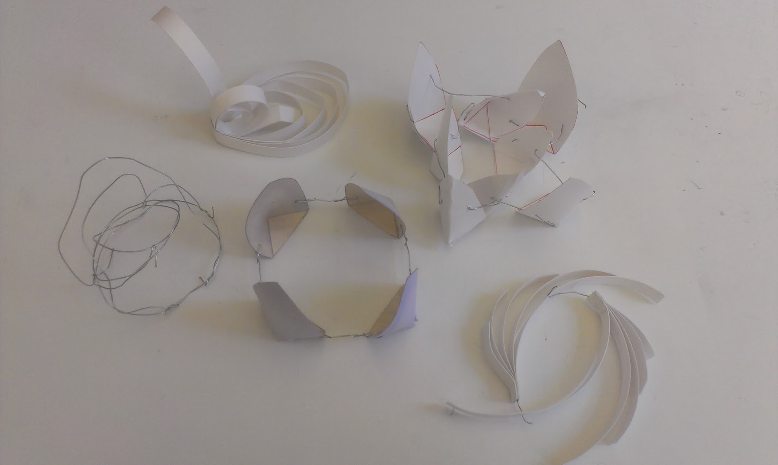
3D Study Models

After working on my thumbnail sketches I developed several study models to communicate my concept of Home.
Final Concept Model


The final 3D concept model has high quality materials, as well as any application of final details, such as color. I tried to emphasize on my three keywords, protection, unity and infinity, by creating layers of protection in my model through forms and color. Wire links the entire structure, unifying it, while the wire loops throughout the structure, providing the sense of an infinite unity which protects me from the outside world that to me is HOME.


Final Parti


A parti is an idea which influences our concept, and here I have a rough draft of my Concept Statement. My parti was influenced by a poem about home, from that I developed my 2D sketches which then turned into my study model, which helped me communicate my idea of Home.


Sustainable Design Context Poster


Sustainable Design has become a trend in recent years; there are many things that designers can do to incorporate very simple aspects to create strong and long lasting design.  I have created a poster that touches on a specific case study on sustainable design, while focusing on sustainable finishes.

I collaborated with a group of people to create the poster’s layout, creating an effective way to communicate the information we gathered. As I mentioned earlier, I focused on sustainable finishes, countertops, and I had a blast researching on the so many options available. I came across recycled paper countertops, recycled glass, beautiful and sustainable options for long lasting design.

I learned to comprehend and embrace sustainable design while creating the poster, it’s all over the news and many people talk about it, yet when we do a little research on our own, things are more clear and then we can fully understand the aspects of such “hot” trending topics.  

 
Draft Poster
 
 Here is our first attempt for the layout, after analyzing our work; several changes were made to effectively communicate our information.


Saturday, April 28, 2012

Process Poster

Process Poster
The assignment for this project was to create a digital poster, using InDesign, that describes the development and process work of a previous project, done in one of our studio classes, without having us present to describe our work. The goal here was to use organizational and layout techniques to display information in a relevant and clear manner. Graphic elements as well as color theory are important in the development of the poster, things need to be cohesive and relate to each other. During this project I was able to enhance my InDesign skills, while learning how to use other software,Fireworks. This project utilized all the skills we have learned so far, Photoshop,Illustrator, InDeseing, as well as our sketching techniques and graphic elements.

Wednesday, April 18, 2012

Resume


Resume

The assignment for this particular project was to create a creative resume using InDesing for the resume layout. Other than focusing on the content and audience of the resume the objectives were to understand and use good graphic principles to organize the information using InDesign tools. It is very interesting how a good layout can make a huge difference when it comes to having people considering you as a potential employee. Creating a resume is a task of its own, yet creating a creative resume is harder than it seems; moreover, creating a minimalistic and simple resume is even more complex. This resume represents me as an individual and as a designer as well. I wanted to show a sophisticated layout, not leaving behind or taking away from the content, yet sophistication does not mean boring, I added color which comes right off my logo, violet and yellow, and to emphasize and tie everything else together an accent hue was added.

Monday, April 9, 2012

Logo


Logo

The task in hand for this project was to create a logo that describes and represents us, using our design philosophy as the inspiration for the logo. This logo was created in illustrator which is a software program similar to Photoshop, and the Wacom tablet. Both tools used to create the logo were completely new to me before starting the process of creation. The tablet is a perfect mix of digital drawing and hand drawing, which takes sketching to a new different level. The design that resulted after pondering for a while, and with the use of the tools provided, represents my stage as a designer up to this point. It is simple, as less is more, combing my initials, G and Z, as well as my last name. There is contrast not only with color but also with the fonts used. I thought a complimentary color scheme would bring to the table the contrast I was looking for. I chose violet and yellow as my scheme since the meaning of the hue describes my character as loyal, energizing and very imaginative, also my friends know that violet is my favorite color. The use of cursive writing describes the side of me that is delicate, formal, and simply beautiful, and that is something I hope to achieve through design.  


 Wacom tablet Sketches


Hand Sketches