Friday, April 26, 2013

Mixed Worlds-Final Project

MIXED WORLDS

My long term project is finally complete, after a long semester of hard work and effort it's great to see the finished product. This project consisted of re-designing the Pufferbelly Depot, in Pullman WA, which used to be a train station and later on served the purpose of a clean canvas to let our imaginations fly. The new design had to accommodate a residence,studio space and a gallery space for an artist who has a spouse that is visually impaired. One of the challenges involved in this project was to design for the visually impaired, and as I have mentioned before on my previous post, Can you Design to Help them "See," a lot of research and hard work went into this aspect of the design. As designers we design for people and our task is to make their living spaces functional and practical. Another important aspect was to come up with a sustainable design allowing for adaptive reuse. This aspect was fun and interesting, understanding that design is not about demolishing existing structures to create something new, moreover, it is designing creatively to mix the old and the new to create the unthinkable. This idea is what inspired my design, mixing the old and the new worlds to create something different.


These boards are the final product, the compilation of this semester's hard work, all arranged in a simple yet interesting way to communicate the basic and essential information about my design to the client.

The first board is the process development board, here the core of my concept evolves, telling the story from beginning to end, inspiration object to final floor plan layout. This board is one of the most crucial boards since this is the foundation of the entire project. Everything links back to the concept developed here, every decision made, every material chosen, every little element  part of the design is not
chosen randomly, it has a purpose and roots from the concept. Two worlds coming together to form a new, unified world; nature and technology coming together.
One drawing is not enough to inform the client and others about the technicalities of the design, there are several of this technical drawings needed, here I have just a few, yet crucial drawings. A section and the demolition plan along two elevations are part of this board. The demolition plan consists of the original walls in the building as well as the new construction walls, designed by me. The section informs the client about the height, third dimension, of the design and the elements found in the floor plans.

This drawing is specially helpful when it comes to understanding ceiling changes. Other drawings that help the client see the space are the elevations. These are "flat" drawings, 2D only,depicting specific areas in the design, here elements such as furniture, accessories, are drawn with great detail and clarity.

The furniture plan is another crucial drawing, here all the selected furniture pieces selected and all the wall changes are depicted. For this project, I decided to render the furniture plan since it is such a easy drawing to read and helps the client understand a bit
 more of where things go and how they relate to the concept and the floor plan.

Other drawings, a bit less technical yet not less accurate, are perspective drawings. These are a bit more fun since this is literally a picture depicting what the spaces designed will look like once built.

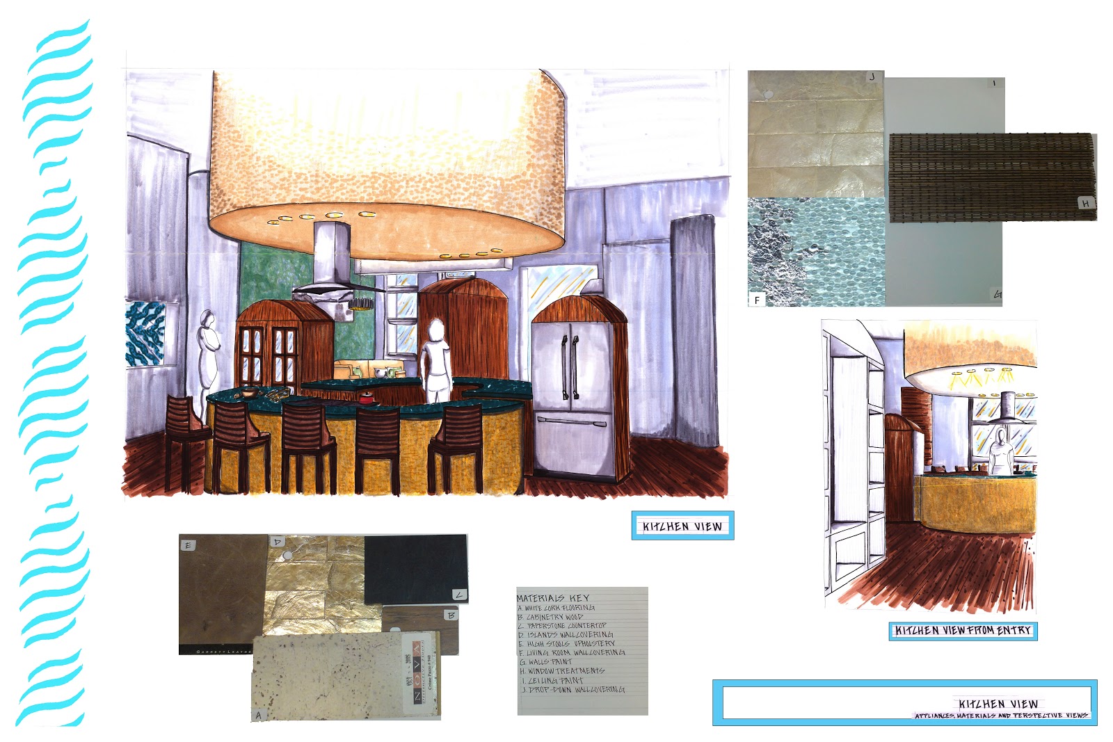
I decided to draw two perspectives of the kitchen since it has a key feature in my design. Two round islands with two vertical elements signifying the union of two worlds, nature and technology. The concept of this design. Samples of materials in these spaces are usually shown on these boards as well, this helps the client see what their spaces will look like not only through a picture but through these samples.

All these aspects are great, fun and exciting, seeing my design come to life, yet other crucial elements are also part of design, the safety of individuals interacting with the space is as important. In this board this aspect is addressed. The egress plan informs the client and the validated authorities about the available exits needed in case of emergencies. The egress path is also recorded that is, the distance from the furthest point in a room to the exit. For this project, the distance could not be more than 75ft. This distance allows individuals to exit the building in a safe manner without any obstacles.

In this following board I decided to include two more perspectives. A perspective depicting the master bathroom and the family room. These rooms have key elements that inform the client about the overall design decisions made. Not everything can be shown hence the importance of choosing wisely to provide the client an accurate overview of their spaces.
This bathroom posses great features such as curved walls and a round shower stall, allowing for a 60 inch turn-around. Drop downs are crucial since they lower the ceiling, making the space feel more comfortable
and intimate. The family rooms shares the ticket wall, a

wall that had to be kept untouched requested by the client. A revolving TV is also found in this room making the space flexible to accommodate people in wheelchairs. Once again material samples are provided to give the client a deeper understanding of the spaces.

A board containing a rendering of the exterior view of the Pufferbelly Depot and a rendering of the site plan is also important information for the client. This drawings show the current state of the facade of the building and the landscape. This is another aspect which I am proud of. I designed the landscape around my concept. This can be seen in the parking lots and landscape features all throughout the depot. I focused in the balance between curved and rectilinear lines.

                                                                                                                                                                                Last but not least is the board containing information about the gallery space and the artist. This was another challenging aspect of the project and a lot of time and research went into learning the best strategies to display art and to keep it safe. In my previous post Art Gallery Visit, I dedicated one day to visit a gallery and learn more about he mechanics involved in these spaces. This was my first time designing a gallery space, this was really fun and interesting. I have applied my pattern, a textile pattern that I designed earlier in the semester; I will talk bout next. This is one way of how I incorporated my concept. Curved clouds and the orientation of the display walls, forming implied movement, are other elements that link back to my concept. I refinished the concrete floor and stained it to create a design mimicking the clouds. Little things like this make a huge difference in design, they make the depot more sustainable. I carried the same color pallete used all throughout the depot, neutrals with blue-green accents. This pallete was inspired by my fabric textile.

Over all this project was a great experience. It forced us to learn and apply new concepts into our design while keeping in mind the restrictions that as designers we come across daily. All that I have learned this semester will definitely help me next semester as well as all throughout my design carrier.

Tuesday, March 19, 2013

Can you Design to help them "See"?

Our long term project, in my studio design class, consists of designing a residence,studio space and a gallery space for an artist who has a spouse that is visually impaired. As designers is important for us to understand our clients and their necessities in order to design a functional space in which they will be comfortable and happy. Most of us do not have a background with visually impaired individuals to help us understand this subject more in depth so our entire class participated in a temporary-impairment experience to give us a "sense of what diminished vision capacity is like for potential clients." We participated in a set of tasks while wearing vision-obscuring glasses, this completely opened my mind and helped me understand that to be a successful designer thinking of the majority is not enough sometimes, we have to take that extra step to go beyond and above.

It is extremely hard to read small font,
and pictures, everything is blurry
with a 20/60 vision.

Looking through the plastics bag was
challenging, yet our eyes do distinguished
contrast between materials.
Our first task was to look through a plastic bag, folded in half, and read a newspaper. We were all surprised to realize that everything was blurry and the newspaper was impossible to read for some of us, yet some others were able to ,barely, read the title font only! Our eyes captured blurry expressions of peoples' faces.It was easier to see light,we were all attracted to well lit places which served as a guide to experience the place. It was also really hard to recognize forms/shapes/people from afar; it was hard to see their faces. This first task made us realize the importance of light for visually impaired people. Now I understand why entrance/exit signage is illuminated, as well as why task lightning is mounted under kitchen cabinetry. Our second task consisted of looking through a vision simulator.


The vision simulator completely broke my heart, I had never stop to think what individuals with impaired vision see, or how  they experience the world.  One common vision impairment is central field loss; as it
Central Field Loss
is appreciated in the picture there is a little dot that blocks vision, making
it impossible to recognize facial features and making reading hard. I can
not imagine what I would do if over time I am not able to see and recognize my loved ones, touching their faces would be a way to hold on to memories of what they used to look like, this simply breaks my heart!

Multiple Field Loss

Multiple field loss is another common vision limitation. The eyes get tired quickly since they are trying to see the "entire picture" through patches. This usually happens to diabetics, making driving hard, as well as reading.


Tunnel Vision

With tunnel vision peripheral vision is lost, forcing people to turn their heads to "read" the environment. This is the exact opposite of central field loss, yet both of these limitations are equally tiresome.


Complete Blindness
The last limitation in our visual simulator tool is complete visual loss, blindness. To me this is such a scary thought, loosing sight and never be able to see what is around me and my loved ones is excruciating. Moreover, after realizing that the design world is forgetting these minorities when designing, leads me to see how we create big issues for these individuals. With a broken heart, after looking through the simulator tool, we continued to our last task, which involved putting on glasses that had a layer of petroleum jelly on the lenses. This was so challenging and an "eye opener" as well.After putting on the glasses, I wanted to take them off right away, I kept blinking my eyes in hope that the blurry vision I was experiencing, at the moment, would go away! These were just natural reflexes asking for a clear vision.

 This task required us to walk around different floors, and spaces in the CUB. Looking through the jelly lenses felt like looking through stained/textured glass. It was hard to identify masses of people from afar, they all looked like big blobs merging together, same as the lights on the ceiling. They all merged into a big blob of light. One thing that really surprised me is that the shade of green zoning the elevators was really hard to see from afar. I was able to see the change in color until I was maybe three to four feet away from the elevators, the wall sconces surrounding the doors helped as well, yet this specific shade of green diffused the light in a way that made it hard to see the color. Riding the elevator was also challenging. The numbers on the elevator were hard to find since they were made from the same material in the elevator, yes they had braille lettering, but it was hard to find them.The buttons lit up after they are pressed, yet it would be a better  idea to have all the buttons lit up at all times, and then when pressed they can change to a different color letting the individual know they have been pressed already. This would also make them easier to find. Having audio announcing the floor numbers is very helpful as well since it does not force people to step out of the elevator to find the label of the floor on the outside. We were all able to identify different materials by contrast, yet when two of my classmates were coming down the stairs the last step confused them and almost made them trip.

Stair steps were either a different color from the flooring, or same color yet with paint/textured strips on the edges to let people know that is the end of the step. This feature is very helpful, yet at the end of the staircase, on terrazzo flooring, there were brass/metal separating strips that made it look like there was one more step, making people trip. One more task was to find ATM machines and find out if the design was "visually impaired friendly", and even though they had many helpful features they are poorly designed. The card slot blinks, making it easy to find, yet reading the numbers and the screen is really hard. We came
Trying to read the numbers on an ATM machine is hard.
across an ATM which had an audio option, yet the font was hard to read, and even though it was on braille as well, it was hard to find, and if people  opted for this option, they had to plug in their own earphones. Why not provide the ATM with an integrated speaker for those who might not carry their earphones with them at all times, or simply don't have them? These are great ideas with wonderful intentions, but sometimes good intentions are not enough to design something that works and that is functional.

I am truly amazed by this experiment. I had never realized the importance of light for human beings and how it can work as a way-finding element. It is easy for designers, who have never experienced what their target audience goes through, to get lost in a sea of good intentions forgetting that a successful design should be functional! I hope this experience helps me design in a smarter to provide a safe space for those who are visually impaired!


Wednesday, March 13, 2013

Art Gallery Visit


During Spring Break I visited the Allied Arts Association Gallery, Richland WA, also known as the Gallery at the Park, due to its location. This is a small gallery space, approximately 1,800 square footage, with a great sense of community. Most of the staff organizing the gallery comes from volunteer hands, this wide variety in background makes display-decision-making even more special. The work exhibited the month of March is by the artists  Joyce and Roy Anderson, paintings, and Susan Bernadine Swanson, beadwork. The variety of work displayed allows for different display mechanisms.

Sketch of Allied Arts gallery

The smaller beadwork pieces were displayed in clear plastic and glass cases on a pedestals, of varying shapes and sizes. These pedestals were positioned at the center of the gallery in a diagonal line, while the pedestals were angled to make the display more dynamic. The rest of the exhibition pieces,paintings, were displayed on the walls. In general, when the exhibit contains only two-dimensional work, a set of approximately 6’x 3’ canvas panels is used. These panels were donated by volunteers. Overall the space is open and full of light.
Track lighting is the main source of artificial light for the gallery, with one big “box” fluorescent light fixture on the ceiling, which seems to be used as emergency lighting since it stays on most of the time, even when track lights are off. The tracks run all the way around the perimeter of the ceiling with a few track on the center. One thing that caught my attention, was the amount of natural light in the space.

Sketch of skylights and beams on concave
ceiling.
There are three elongated windows, reaching from the ceiling to the floor.  There is also a row of skylights near the entrance of the gallery space, five windows ranging from, approximately, 5’x 5’ to 4’x 3.’ When asking the staff about the treatment on the windows, they clarified that this information was unknown and that the artwork displayed stays in the gallery for only a month. It is also the responsibility of the artists to protect their work since most of it comes in framed and ready to be displayed, yet the structure of the building allows for minimal damage, if any at all, since there are many interesting angles that shape the structure. Curved walls, and a portion of the roof limit/control the amount of natural light coming in.

Audience is definitely guided through the use of exhibit pieces and position of any movable devices, panels, cases and/or pedestals. As mentioned before, the pedestals were positioned in a centered diagonal line, diving the space into two zones, foreground and background. Key elements such as the artists’ names and their “star” piece, usually positioned under the name, go on the back wall; clearly visible from the entrance to the gallery emphasized with a spotlight. There is also a special challenge at this gallery space since they have to display work on a curved wall, limiting the positioning of big art pieces on this wall.

As many other gallery spaces, the environment colors are white and soft neutrals. The walls are white with a satin finish, a bit of light is reflected yet a balance between function and aesthetic is kept  since it is easier to maintain this finish than a matte finish. The floor is covered with a gray carpet, complemented by an off-white/gray grid paneling system on the ceiling. These color choices allow the artwork to shine without any visual distractions in the environment.
Overall this was a great visit, I got to learn about gallery spaces while enjoying a great exhibit. This confirms why I have decided to become an interior designer, realizing how small details such as lighting or color direct us in a space unconsciously,this is just amazing!

Friday, December 7, 2012

Final Project


Residence Design
 
Over the course of the semester WSU Interior Design sophomores worked with Seth Anawalt to redesign the St. Elmo Hotel, a historical building in the Palouse WA. Our task was to design the second floor which includes a one-bedroom apartment, a two-bedroom apartment, a common area and a spa. We were in charged to remodel the one-bedroom apartment and the common area for or final project.
 
As I previouly mentioned, in earlier projects we designed the kitchen and bathroom of the two-bedroom apartment of the St. Elmo Hotel. Both of these projects were very challenging since this was my very first time designing a kitchen a bathroom. The most challenging of the two was the Kitchen since there are a lot of codes and standards that need to be followed and I had to learn many of this. The bathroom project was easier since the same standards i had learned before for the kitchen project also applied, yet designing an entire apartment was different and challenging as well.

 Process Poster 

This is the firt of four posters. Here I have included my inspiration as well as the concept model from which my design originated. The second floor, floor plan is also included as well as materials used more than one throughout the one-bedroom apartment and the common space.

 
There are several areas that make up the apartment design, entry, living room, kitchen, bedroom and bathroom, even though there are five key areas, they all need to work as one to form a cohesive and holistic design. The client asked for an open floor design, flowy space almost as if you coul dance in the space. My approach to this design was to create a sense of unified infinite protection in the space. To accomplish this, I incorporated layers in the space as well as curvilinear line to represent the linkage of a unified protection. Layers are also visible in the color palate; I choose a complimentary color scheme of yellow- purple with red accents. Each of the colors relates to my concept of home, and represents the meaning of home for me; yellow represents the warmth I find at home, while purple represents the loyalty and respect also found at home, while red represents the love of a home. Each of the spaces emphasizes a specific color from my color scheme, this way layers are created.
 

Bedroom and Bathroom Poster 


This is the second poster, displaying elevations and perspectives of these two spaces, as well as the materials used.
  Bedroom Perspective                                                         Bathroom Perspective   
Here the color choices and the
layout of the room can be
is clearly visible.
The ceilings were an important part of
the project, here I played with the
volume of the space by adding a soffit,
dropping down the ceiling above the
shower stall and adding a three feet
long chandelier.
Perspectives help the client see the space in 3D form and allow them to visualize materials and  structural features drawn in technical drawings such as elevations and floor plans.

 
Living Room and Kitchen Poster 

 
Living Room/Kitchen Perspective
 In this poster, I have included all the materials and elevations of these two areas, as well as the floor plan of the apartment. I have one overall perspective which displays the living room and kitchen very accurately as well as a dining area. As seen in these posters, each room is emphasized by a specific color in the palete and then accented with the other two colors in the palete.


Common Area Poster 


      Common Area Perspective

As seen on the perspective, the
same color palete has been carried to
the common space as well. A fire place
provides privacy for people coming
out of the elevator and those on the
seating area.
In this last poster I have, as in the previous poster, included the common area materials, floorplan and perspective as well as the entry eleations of the apartment. These elevations are here since in the floor plan I have shown the entrance to the one-bedroom apartment.                                                         


One key element of design  is to be able to visualize the space not only in 2D but also volumetrically, 3D form, this can be done through renderings, or in this case through a study model. This model helps me see the space as if I were walking through the apartment.
 
Volumetric Model 


Interior of the space, with a volumetric kitchen, shows the scale and flow in the space. A coffered ceiling helps lower the 10 ft high ceiling visually, runs trough entire apartment, except in the bathroom.

 On this project I have learned a lot and grown since I first design the kitchen and bathroom in the two-bedroom apartment. I used the same concept, yet the aesthectic in the one-bedroom apartment reads better and it is also more functional than the two-bedroom apartment. I feel very accomplished and happy with the choices I made.


Habitat for Humanity

Volunteering


Volunteering for Habitat of Humanity was a great experience, not only the fact that it is for a great cause; to help people with low income to build their own houses, it was a hands-on experience which made me think of the other side of deign. All the construction that goes with it. It was fun to cut drywall and to learn how to put up. All the insulation and what it does to the house, very energy efficient.  
  One thing that caught me by surprise was the passion that the people in charge they put into this houses. They strive to make those places a home, and not just a simple house with walls and a roof. Taking a concept and carrying it throughout the entire design was pleasantly surprising, from rounded arches in the living spaces, to curved beams on the outside and a curved fan door. I have to say this is not very usual, I have volunteered before for habitat of humanity, yet I did not see the same passion.
Overall I feel very fortunate since I got to learn from people who care and are passionate about what that they do. That inspires me to keep fighting for what I want. At the end all that matters is whether I am happy with what I do, and that is something that shows on people.   

Client Brief

Client Brief

Over the course of the semester, we had to design for Seth Anawalt, the owner of the St. Elmo Hotel, in the Palouse. Over this short period of time we had an interview with him to know more about what he was expecting from us, what his needs and wishes were. This was just the beginning of a very long process, in which questions kept adding up and more issues kept rising. In this document, we briefly describe the goals for the project, the client's philosophy, the challenge presented to us and much more. Every project seems to never end, since it keeps evolving and changing with time. 

The client brief is a long document, yet, this time I turn it into a poster, once again the same rules for visual communication apply. In this instance I based my grid on the rule of thirds, I also have blue strips that move up, diagonally, which help carry the eye through the entire poster. The right bottom corner is balanced by the top left corner, which gets the eye attention due to its hue.
Overall I tried to come up with a layout that makes sense to communicate such long writing visually.

Wednesday, November 21, 2012

Prefessional Designer Consultation

Over Thanksgiving Break, I meat with the practicing designer, Carolyn Corrado, from Spencer & Carlson, as well as the owner Paula Spencer, who reviewed my final project for the semester. I got great feedback from Carolyn, who carefully looked at my floor plans and sketches for the St. Elmo project.

As I previously mentioned, we have been redesigning the St. Elmo hotel, in the Palouse. For this final project, we have to design an entire one-bedroom apartment and common area on the second floor; things are becoming a little bit easier since I previously designed the kitchen and bathroom for the two-bedroom apartment.  

The time I spent with Carolyn was very helpful and inspiring; she and Paula suggested making some changes in my plan, which I’m very glad to make, since it will make my design more functional and livable. Pulling furniture off the wall makes a space more livable, since that is how people live, great advice from Carolyn, which makes total sense and helped me view space differently. She also suggested making 3D renderings of each area in the apartment; it will help see the plan in a different light. I had the opportunity to view some of the catalogs they use in Spencer & Carlson, which will enhance my design. Walking around the showroom inspired me as well; I have become an idea machine.

Great ideas to better my design resulted from this consultation. I am very glad I was able to experience this since I have several resources, provided by a professional, which will further develop my designs. Carolyn also offered her help for whenever I have more questions further in the design process, as well as looking at my work once again if need be. This resulted in a wonderful experience; I never imagined that professionals in the field were so eager and glad to help students like me.

Monday, October 22, 2012

Bathroom Project


Bathroom Project

This bathroom project, as the previous kitchen project, was challenging and new to me. Designing a bathroom that meets ADA standards, while still keeping it aesthetically pleasing and incorporating my design concept is a challenging thing to do, yet the struggle made me realize and learn more about design, especially bathroom design.

This bathroom is part of St. Elmo Hotel, Palouse, apartments, and it is located in the same place as the kitchen, below. It is important to carry the design aspects of the kitchen to achieve a harmonious and holistic design in the entire apartment.

As I mentioned before, this is my very first time designing a bathroom, and it is incredible to see the amount of information, specific standards for bathroom design, that I learned in such a short period of time. I built my knowledge by first learning about bathroom design through reading and keeping a record of that information, which later I put into practice. I designed around the ADA standards and sustainability, some people might see this as a challenge, yet this is when true inspiration and creativity kick in, to please the client and produce a functional and aesthetically pleasing design. The client asked to re-use the most possible of the materials in the building, this is when I decided to use lath, one of the most abundant materials in the site, in one of my bathroom walls, it became the main wall, representing the key element of the project, sustainability.

It is amazing to see my design transform, from a parti sketch, a concept model, to later develop into a bathroom design. It is fun to see the transition from my kitchen design to the bathroom, how the use of different materials and location does not affect the cohesive relationship between the two.
 
Bathroom Project Poster
 
It is very important that, after all our hard work and effort, this information is presented in a clear and readable manner. It is important for the client to visually see and understand all the phases of the project. For this poster everything was drafted, and then all the work was scanned and arranged in InDesign to produce a digital poster.
 
 
Volumetric Bathroom Model

A volumetric model helps us visualize the space created in a floor plan, 2D drawing, in 3D. It is important to understand the relationship between 2D and 3D drawings and the correlation in the actual space.


In this image elements in the shower can be appreciated, a 5' turn radius allows a wheel chair to enter the shower. The toilet is also ADA accessible, allowing a side approach!


Monday, October 8, 2012

Kitchen Project

Designing a kitchen is a very complex task, and a few days ago I came up with my own design. This is a very challenging task since there are many considerations that need to be taken into account, little things such as 3 inches clearance to open a cabinet door so it won’t block any other doors is vital. Or having a 5 feet turn around for accessibility.


The owner of St. Elmo Hotel, Palouse, asked the WSU interior design sophomores to design a kitchen for his hotel, and sustainability and accessibility are key components in the design.

 This was my first time designing a kitchen; it was very interesting and educational to see the design come together. Learning about all the clearances and all the things that need to be taken into account goes over the aesthetics of the space, things such as programming, surveying the owners and understanding what the needs of those occupying the space are very important. Aesthetics is just a minimal part of the whole design process, I knew it was beyond that, yet I did not know to which extent. I have learned to appreciate design in a deeper level, and now I over analyze things, and think of their functionality. After dealing with all the design aspects of the kitchen, it needs to be presented to communicate ideas in a clear manner. This was the second part of the project, organize and communicate our ideas.

 Poster composition is very important, as well as the quality of drawings, elevations, sections, plans, and perspective sketches. Everything has to come together in the final presentation, since this is when all the hard work shows off and communicates our ideals. Producing high quality work takes time and effort something that can’t be done overnight. I learned that the hard way, and managing my time is very important and crucial.


 Volumetric volumes are also part of the design process, this helps us see ideas in paper in 3D and allow designers to visualize the space biegn designed.

Accessibility Sketch Journal

Ride, Don't Walk
One challenging experience was to ride on a wheelchair, to experience how people with disabilities view the world, and how the world looks at them. For one it was very interesting to notice how people keep staring at other people with disabilities for a long period of time, making it very uncomfortable. The other aspect is to notice how many buildings are not suitable for Accessibility, especially old buildings, which don’t even have big enough doors to allow people in a wheelchair through.


Doors in Daggy Hall, WSU Pullman, had barely enough clearance for the wheelchair, yet no clearance for my hands, hence I'd hurt my hands rolling  the wheels while going through the door.
  Elevators are also a problem when it comes to accessibility if they are very confined, not enough clearance and space to move around. This was my first time getting in an elevator using a wheelchair, a small elevator I have to say, and it was very challenging, as it can be appreciated in the image above it was hard to enter the elevator and little clearance made it hard to maneuver the wheelchair, to the point that the doors were closing on me, if it was not for my classmate helping me, those doors would have bruised up my arms.
  
I had to exit the elevator by backing out in reverse, since it was hard for me to change my position once in the elevator.


Entering a restroom was hard, yet trying to enter a bathroom stall was even harder when it is not accessible. The clearance behind me, was not enough to turn and the stall was not big enough, period.

I was not able to get all the way in, this is the farthest I could get into the stall, if it was a real emergency, I don't know what whould have happened.

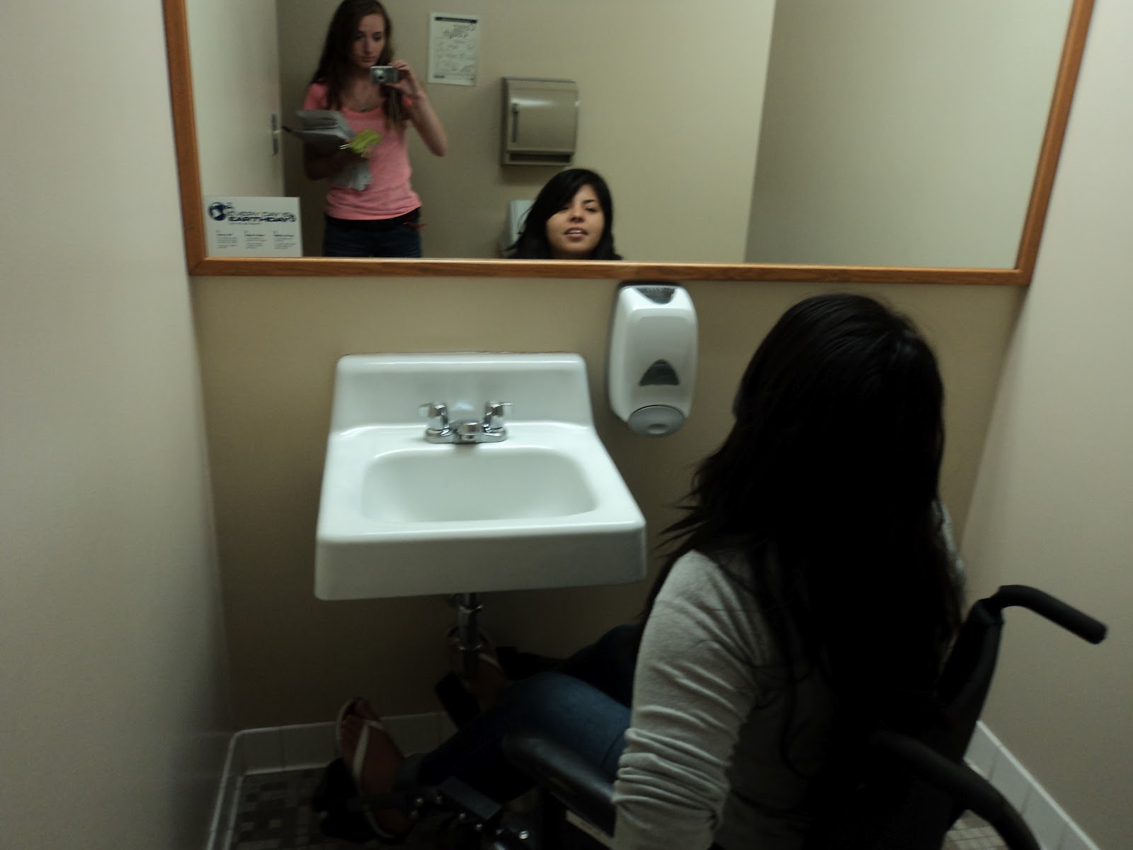
One more thing in accessible restrooms other than enough clearance, is to have space under the sink, which in this case it did not became an issue, there was enough clearance underneath, yet the mirror is not tilted, I had to stretch my neck to see my reflection in the mirror.

When asking for a cafe in our Expresso Bar, it was hard to see beyond the counter, my view point is very low, compared to the people standing behaind the bar.


This is the first thing I saw looking straight at the bar, I had to look up to see beyound this point.


People behind the coffee bar had to stretch over the counter to see me.


This sketch shows all I could see after looking up, I do not see any of the appliances behind the counter, not even the big refrigerator, all I see from it are the red and yellows stripes on the back. It was also hard to read the signs.

  This was my second try at entering a bathroom stall, an accessible one, there was enough clearance for the wheelchair, yet I found it hard to turn around.


After this exercise now I understand why ADA stalls are so big and usually the toilet is at the corner, before this I had never really paid attention to this fact.


Opening the door was hard, as it was before entering the bathroom, the handle is in a very awkward position and as it can be appreciated in the image above, reaching out to it was hard as opening the door was blocked by my feet and wheelchair.

This experience taught me a whole lot, not only as a designer but a human being as well. Design is for people, and its major goal is to be functional for everybody not only for certain people, design needs to be universal, and I am very glad that in recent years people have become more conscious about this issue. Personally, I have a friend with a disability and it is irritating when design does not accommodate to his needs since it's hard for him to accommodate to design. I have a new respect for people with disabilities, since they have being adapting to design, and this is very hard.


Showrooms and House of the Immidate Future

Attending showrooms was one important aspect of the study tour in Seattle, we had the opportunity to attend many including Knoll. Here we met the representative of Knoll and had some time to sketch furniture in the showroom. We also visited the House of the Immediate Future, which was designed with sustainability in mind.

During the Knoll visit, I learned a lot of office design, specially furniture and textiles. Knoll has great desks chairs which allow for comfort in the work place, which nowadays is more open and cooperative; hence furniture is designed around these specific needs. Walls are lower to allow communication in the work space, and storage space is maximized.


  These are some of the sketches in Knoll showroom.


One of the many visits in our study tour was the House of the Immediate Future. A prototype house honoring the 50th Anniversary of the 1962 Seattle World’s Fair, which commemorates the houses of the future, latest technology.  This house is a display to showcase the work and passion that goes into building these houses as well as the energy-efficient aspects of the prototype home. One very interesting feature in this particular house is the “Wet Block,” a yellow block in the middle of the structure, where all the plumbing, and wet aspects of the house, connect to. This is very efficient as well as the thick walls filled with insulation to keep cold air entering the house. Big windows that run all the way to the floor allow natural light to come in the space, maximizing natural light and minimizing the use of artificial lighting.


House of the Immediate Future Exterior


This sketch shows the House of the Immediate Future's exterior, just behind the samller house, horizontal lines that go from top to battom of the side of the house can be appreciated, this is the Wet Block I mentioned earlier.


House of the Immediate Future Kitchen


This is the kitchen in the house; here once again we appreciate the yellow wall, the Wet Block. I like the white cabinetry it is very clean and interesting. The window right next to the kitchen allows a great quantity of natural light to come into the house, as well as the other windows in the hallway to the left. Do to the width and thickness of the window this could work as a sitting area or storage.